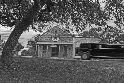
photo by alex.tango.fuego...click on the photo for the large size...
Titled "Driftwood, Texas"...
Or is this better? Or just different? I'm not sure what I think about "fine art" photography always expected to be black & white...for me, the yellow sign in the distance and the red gas pump "make" the photograph...in the black and white version, those two elements are lost...


3 comments:
Alex, I like it much better in color. E
I'm laughing 'cause the limo is wider than the gas station :-)
Some shots work better in b/w, and some work better in color. I think this one looks better in color, but needs a bit more contrast.
I prefer the colour, and I think I prefer it *because* the subject itself is almost monochrome. The colours are very subtle and visually fascinating.
Post a Comment